Built a full-stack wellness e‑commerce experience with React, Express, and Supabase.
Cosmic Care
React.js Express.js Supabase
Wellness e‑commerce fully functional website with payment integration experience. The project focuse on calm, intuitive shopping and clear product discovery.
Project Overview
Role
Full Stack Developer
Timeline
3 months
Responsibilities
UI engineering, front-end development, responsive layout, database integration, accessibility
Case Study
A closer look at how I approached the challenge, shaped the user experience, and built the final interface — from early ideas to polished execution.
Problem
Many wellness e‑commerce platforms feel cluttered and emotionally disconnected. Users struggle to navigate, compare products, and feel supported during their journey. My challenge was to design a calm, intuitive experience that builds trust and reduces friction.
Process
Research & Insights
Analysed user frustrations, behaviour patterns, and emotional triggers in wellness shopping flows.
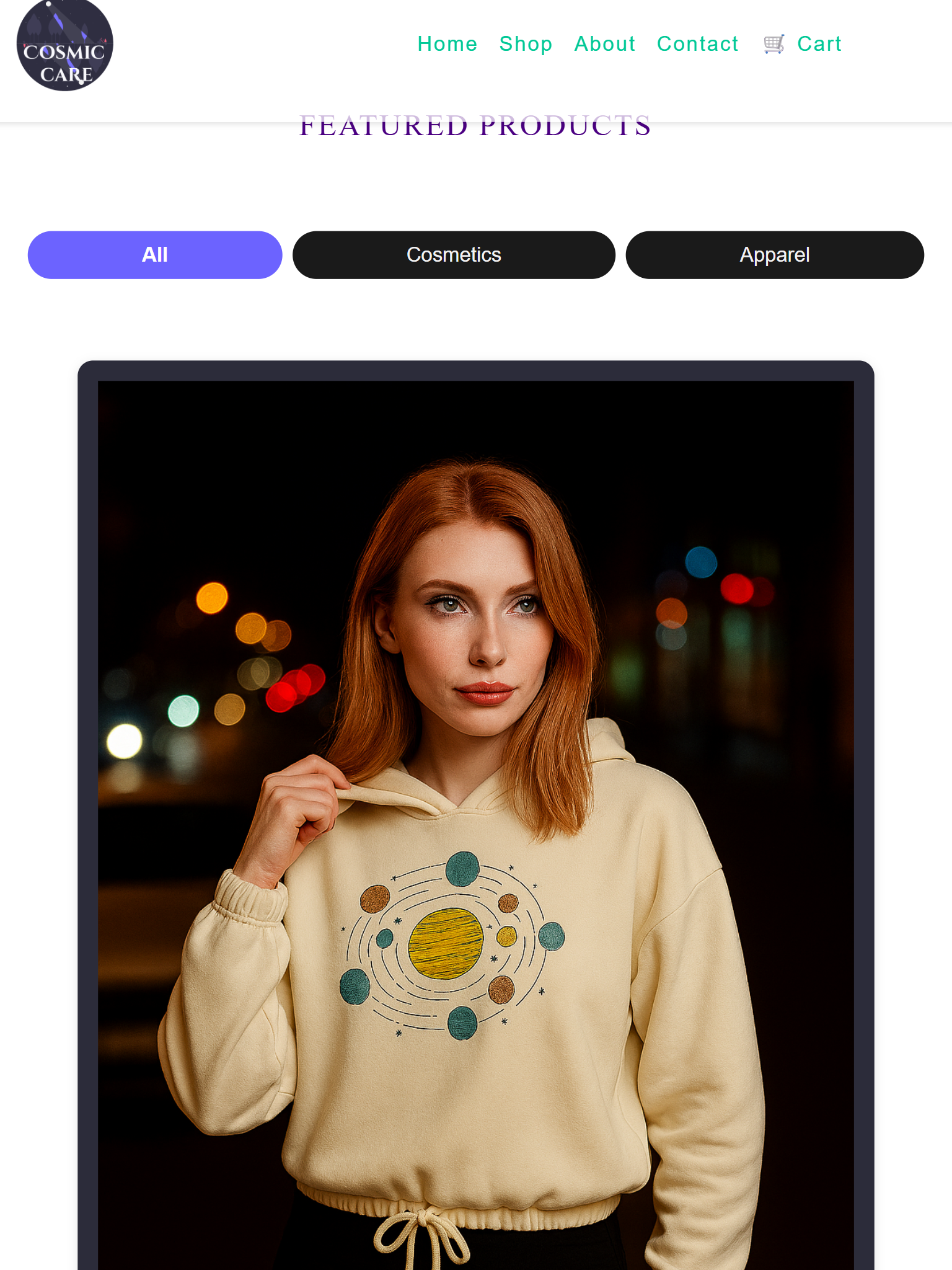
Item page
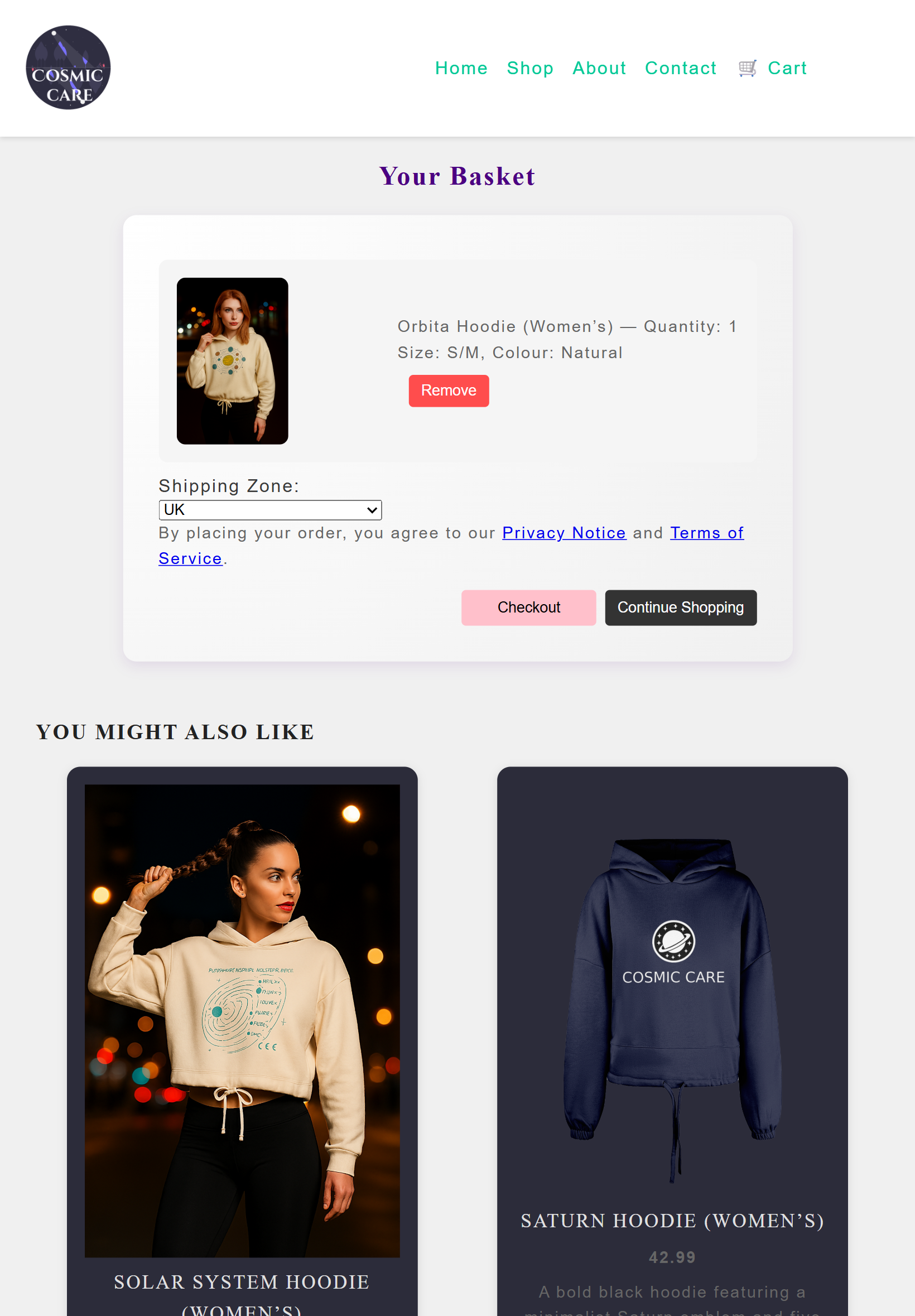
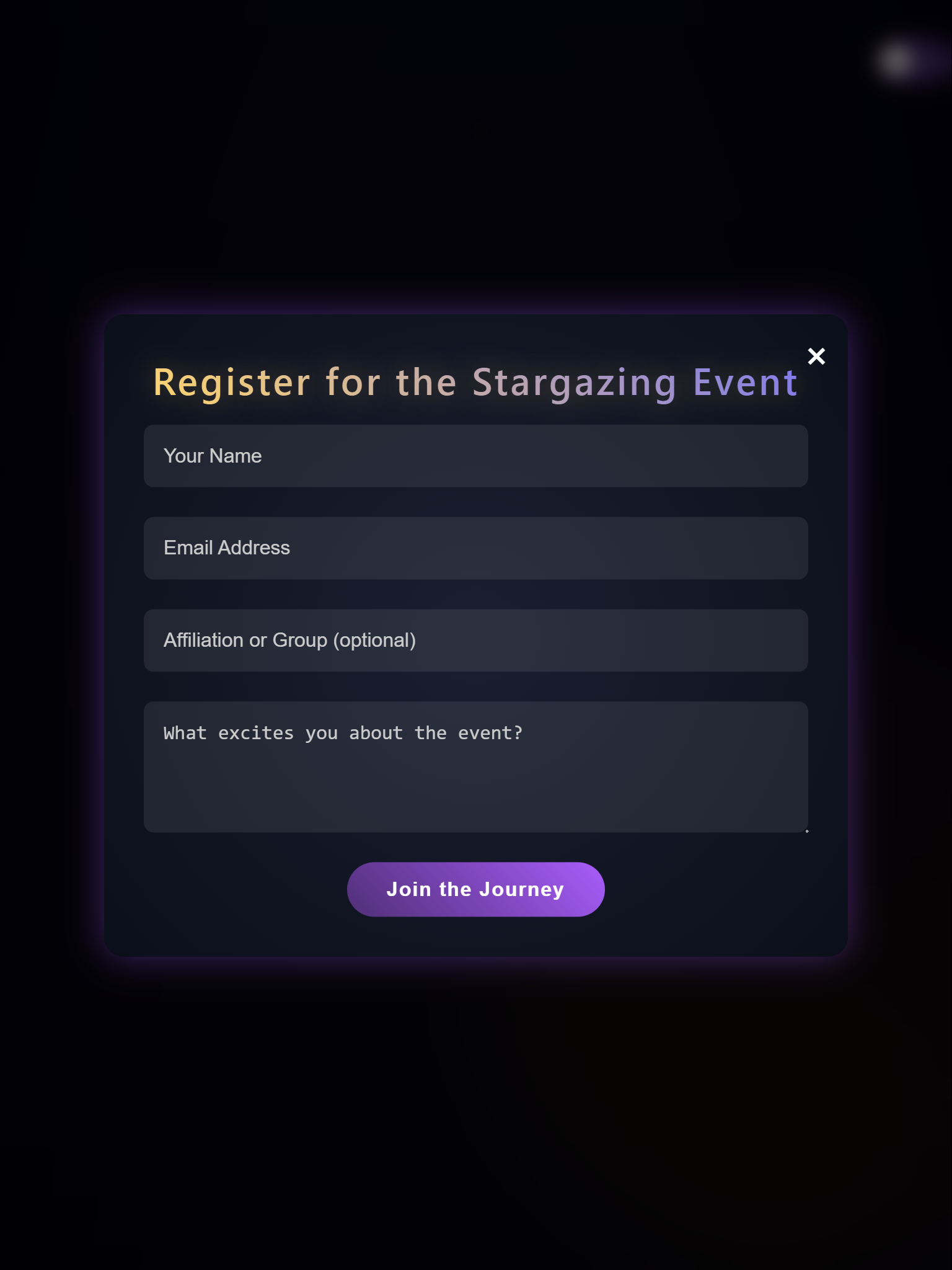
View basket
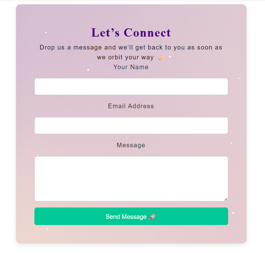
Let’s connect form
Design Decisions
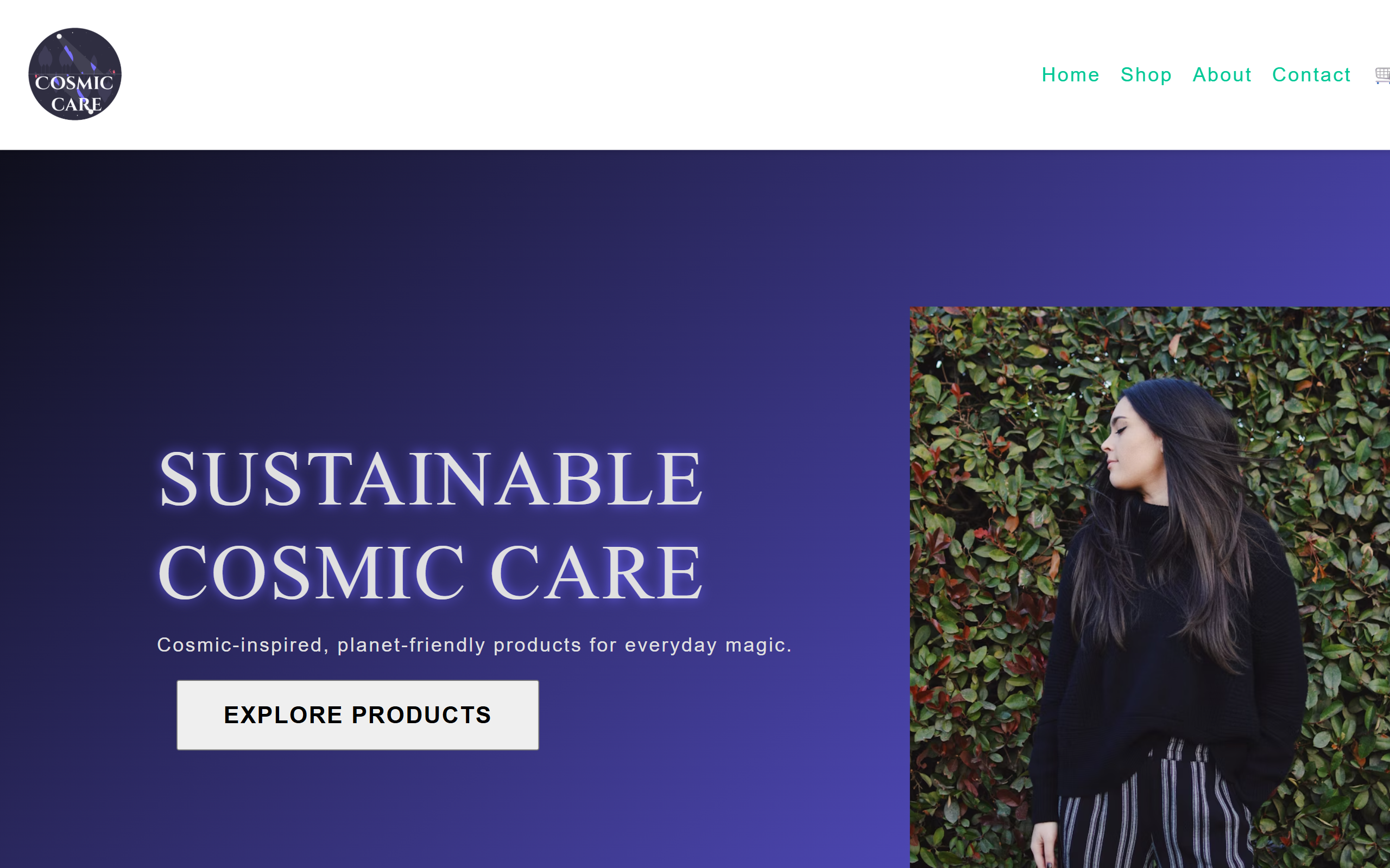
I used deep blacks, purples, and subtle gradients to evoke a cosmic calm. The interface prioritises clarity, emotional connection, and frictionless navigation.
Outcome & Lessons Learned
The final product delivers a tranquil, focused experience. I strengthened my accessibility approach, improved React state management, and refined reusable UI component patterns.